Brand.
The Mobile Byte Sensei logo, colours and rules, with every file you need. Use them as supplied; don’t redraw them.

For a format not listed, write to hello@mobilebytesensei.com.
The Knot.
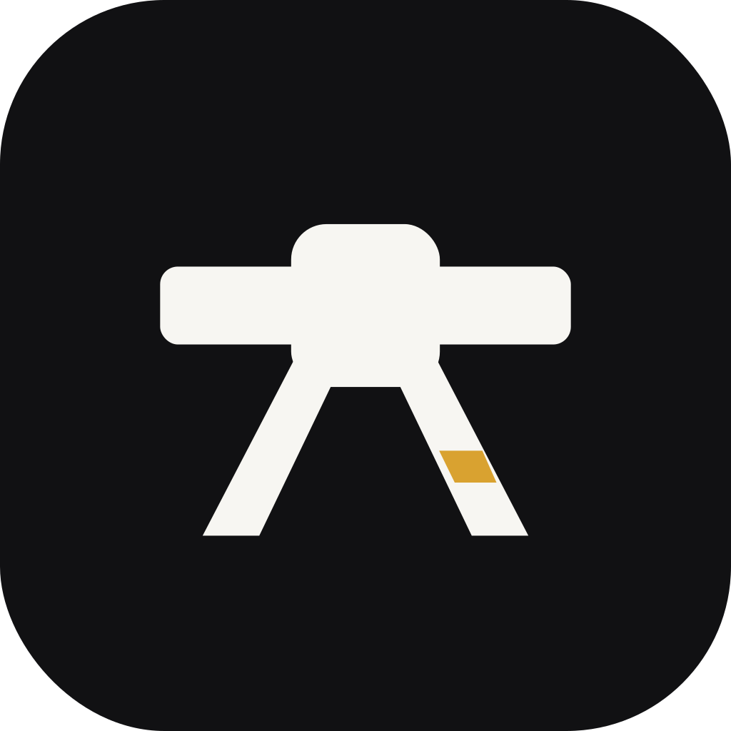
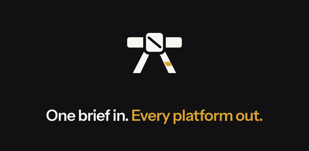
A black belt is one strip of fabric tied into a single knot: the sensei’s mark, and how the company works. One brief, tied into one accountable delivery, that carries every platform.
- The band
- The brief: one continuous strip, with no seams.
- The knot
- The team that ties it, with a single visible fold.
- The tails
- The delivery, leaving in every direction it needs to go.
- The rank bar
- One bar of gold: the only accent the brand uses.
Colour.
Belt black and paper carry almost everything. Gold is spent only where a rank bar would go.
- Belt black#111113The symbol, text and every primary action.
- Paper#F7F6F2The ground; the symbol and text on dark surfaces.
- Rank gold#D9A230The rank bar and one highlight. Never text on a light ground.
- Ash#6B6B70Secondary text.
Files.
SVG masters have outlined type, so they render the same anywhere without the font installed. A guide to every file is in the asset readme.
Logo · vector
Outlined SVG masters with transparent grounds. Use these wherever a vector is accepted.






Logo · PNG
Transparent rasters at three widths for documents, slides and tools that need a bitmap.






Symbol
The knot on its own. SVG in four colourways; PNG from 16 to 1024px. Files at 24px and below use the small-size cut.






App icons
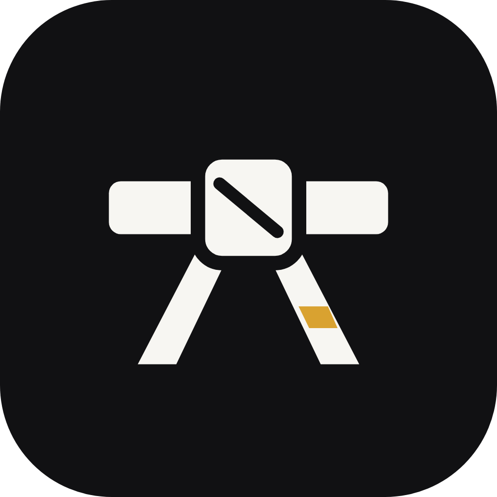
Belt-black icon with rounded corners, plus full-bleed versions for stores that apply their own mask.






Social
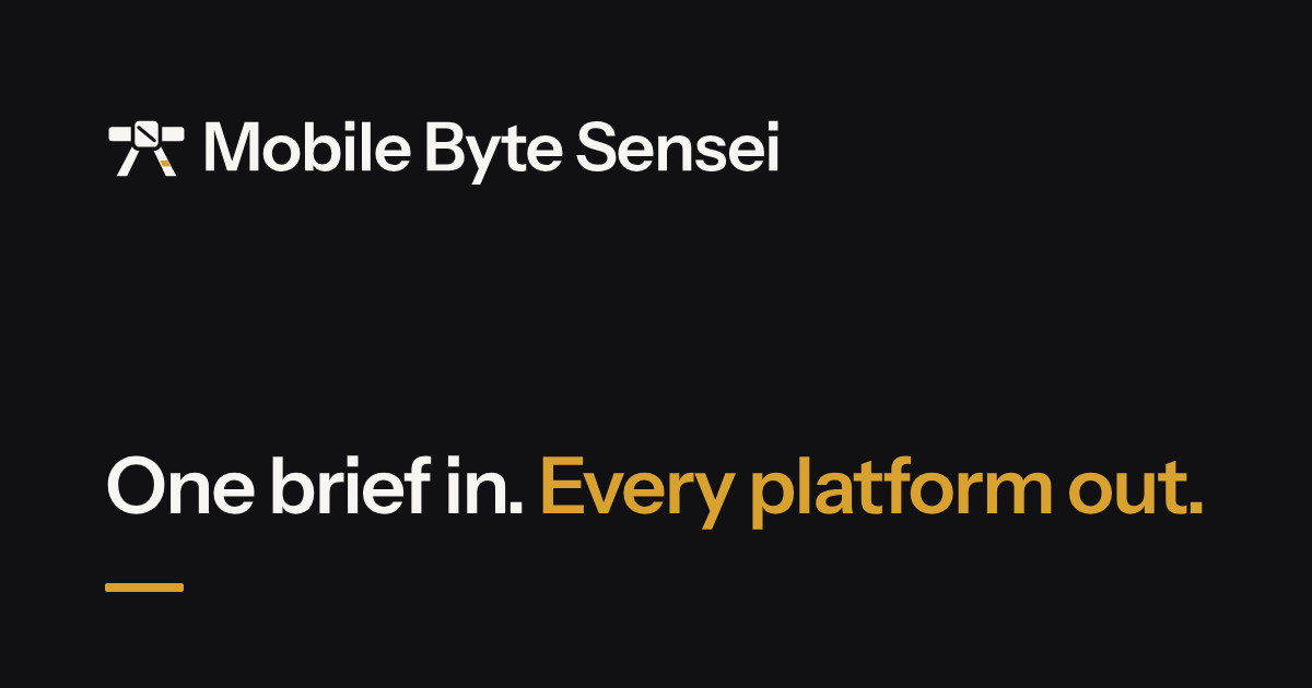
Sized for each platform’s crop, all on belt black.



Asset guide
What each file is for, the colour values and the rules, in one plain-text document.
Using the logo.
The mark stays recognisable only if it stays the same.
- Clear space
- Keep the width of the knot clear on every side. Nothing enters that space: text, edges or images.
- Minimum size
- Symbol 16px on screen (small-size cut) and 5mm in print. Horizontal lockup 120px wide on screen and 30mm in print.
- Colourways
- Belt black on light grounds, paper on dark grounds, or one colour where printing requires it. Gold appears only in the rank bar.
- Typeface
- Instrument Sans for the name and headings; Inter for running text. Both are open-source.
- Don’t
- Stretch, rotate, recolour, outline, add shadows or gradients, redraw the wordmark in another typeface, or place the mark on a busy or low-contrast ground.